Widgets are used to add page content. Some widgets reference "page types" in the content tree. These widgets will pull in this content so you wont have to edit them on the individual page. Other widgets are editable within the widget properties on a page.
To view the widget properties click on the gear icon on the right hand side when hovering over the widget (this does not apply to rich text).
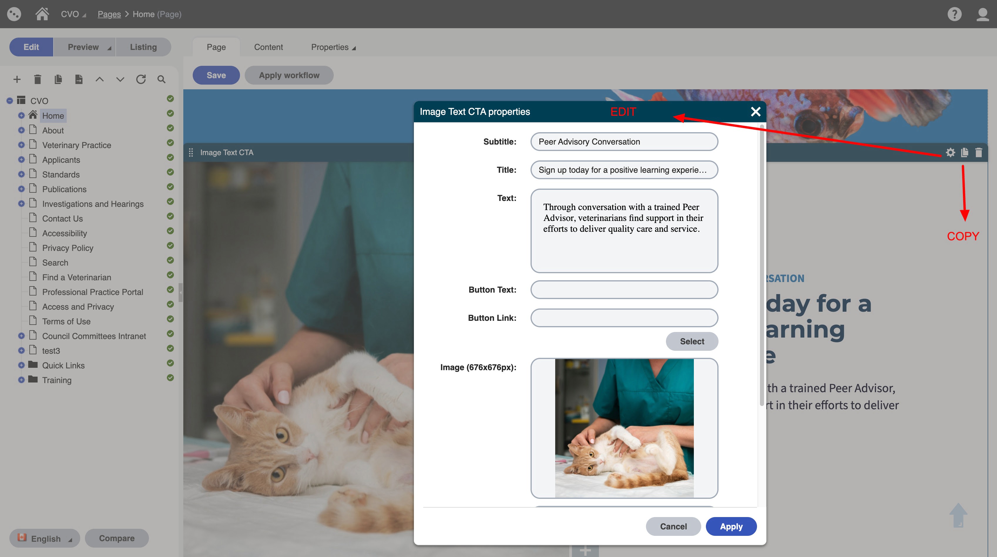
Note: if you click the "copy" icon next to the gear icon on the widget it will make a copy of the widget. When you go to the widget menu you will see it copied on the list. This is helpful if you like the styling and content of a widget or what to reuse the widget.
Content Editing Widgets Used on the website
| Widget Name | Screen Shot |
|---|---|
| Accordion | 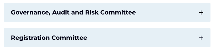 |
| Anchor |  |
| Audio Player (only works for hosted audio files) | 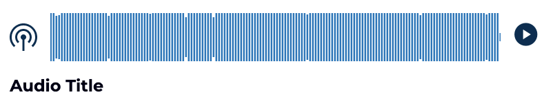 |
| CTA Banner |  |
| Featured Pages Listing - with image | 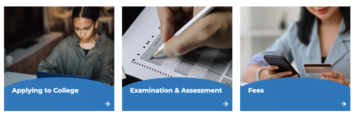 |
| Forms Listing - Blue Cards with Icon (you can also use Rich text) |  |
| History Slider |  |
| Image Text CTA |  |
| Image Text CTA / Floating |  |
| Link box with Icon |  |
| Links (blue) Listing (you can also use rich text) |  |
| Quick Links with Icon Listing |  |
| Rich Text | See below |
| Tabbed Content |  |
| Tabbed Content with Numbers |  |
| Title, Subtitle and Text Centered |  |
| Topic Card Listing |  |
| Video (this will work when we go live) |  |
Rich Text Widget
Styling Options
Use the backwards "P" paragraph styling icon to select headings and font style
Heading 1
Heading 2
Heading 3
Heading 4
Heading 5
Heading 6
- Normal Text - (note you might have to scroll up on the dropdown menu to see this - it is the first option)
- Bold Text
- Underline
- Link
Audio Download (only works for audio files)
To create a link button. Highlight the text you want to link:
- Select the "insert link" chain icon (beside the picture icon)
- Click on select to select the page
- Once you have your link it will work as an underlined link (good for links within sentences).
- To add button styling click the link once and you will see a styling menu:
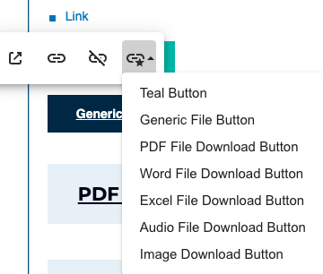
If you dont like the option you chose or need to change it, click on the option you previously selected (it should show in grey). When you click this again it will reset and allow you to chose the new style.
To add images:
- Select the "image icon"
- Click select to select image
- Change the dropdown to say "Images" or other media library (it defaults to Documents)
- Find or upload you image
- Click select
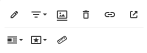
- Click on the image to get the image editing options (below). Normally you will want to adjust the size or alignment. Setting the width to 100% will scale it to the width of the rich text widget.
Other Styling within the rich text widget:
- add bullet lists by selecting the text and selecting "unordered List" Icon
- This is an unorderedlist
- This is a nested unordered list item
- this is a second unordered list item
- This is the second item
- add numbered lists by selecting the text and selecting the "ordered list" icon
- note that sometimes styling is copied over from another document and the spacing is too large. To fix this just highlight the list and click the button again and it will correct the spacing.
- This is a numbered list
- this is a nested item
- this is a nested item
- This is a second level ordered item
- Indent the text with the last two icons on the first row
- To view code or paste code (like an embed) click on the code view icon (the last icon)
- To view the rich text editor in full screen mode click on the fullscreen icon next to the printer
Best practice for the rich text widget is to use multiple rich text widgets on the same page to split up the content. This allows you the flexibility of adding anchors or other widgets in between to split up content. It also makes it easier to use the editor because the controls are at the top.