The Pages Application is where most content editing work is done. This is where you edit, add, delete pages of the website.
To access the "Pages" application simply click on the "Pages" card on the dashboard or click on the Kentico logo in the top left of the CMS to open the application menu. From the application menu you can search "pages" or open it in the "Content Management" section of the menu.
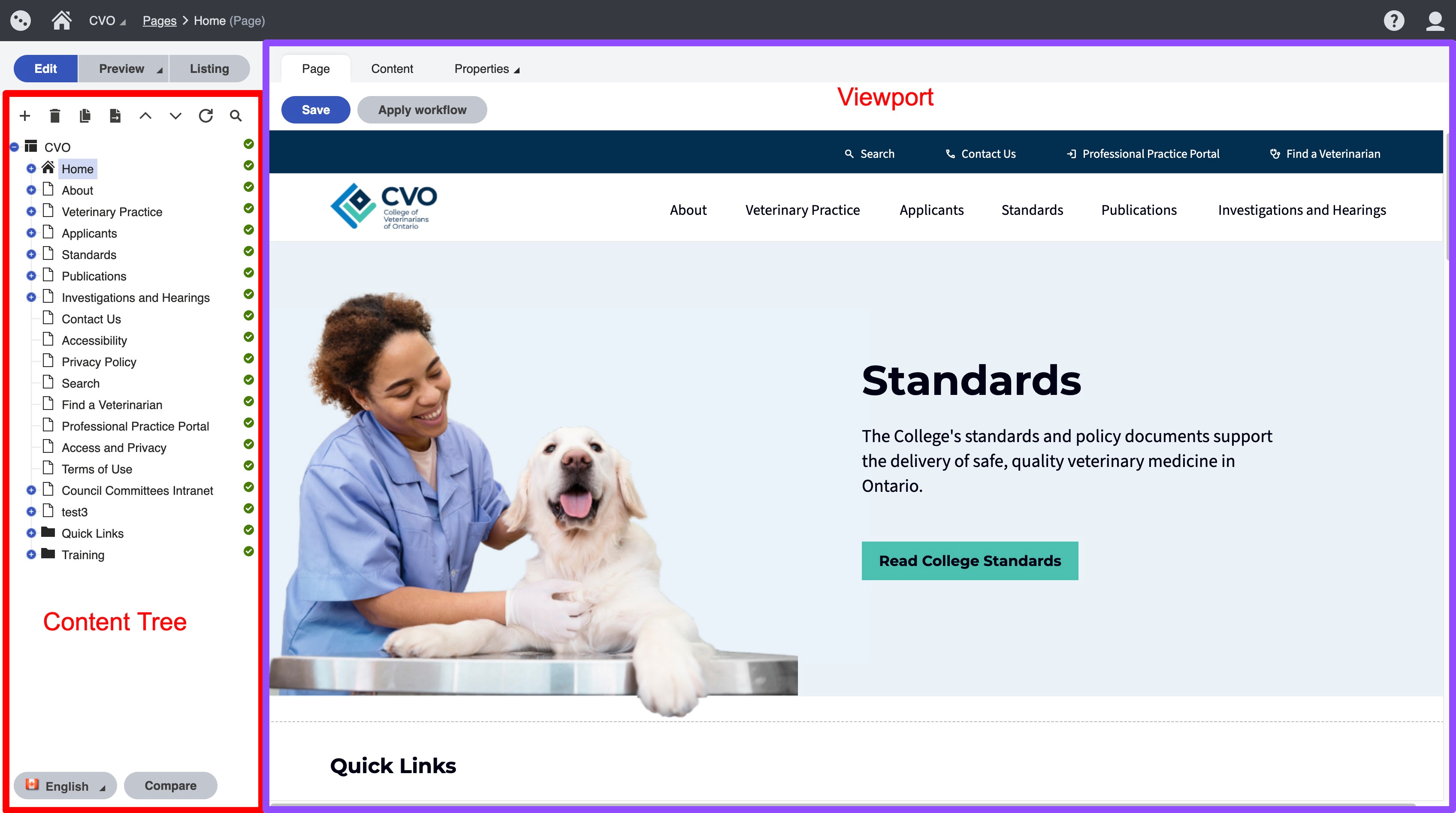
Pages Application is divided into two main sections: the content tree on the left frame and the viewport on the right frame.
Overview
- The content tree: this is a repository of page types that make up the content of the website. When an item is clicked it will display in the viewport.
- Page types: elements that are contained in the content tree that represent content on the site. Page types do not necessarily have to be traditional pages of a website they are all the elements that make up pieces of a page. It is helpful to think of page types as content, containers of content, as well as pages.
- Viewport tabs: Page, Content, Properties tabs will display different content selected from the content tree differently depending on how the page type is structured. For traditional content pages content is editable on the “Page” tab with the page builder and widgets. For page types that are pieces of content, the content is edited on the “Content” tab.
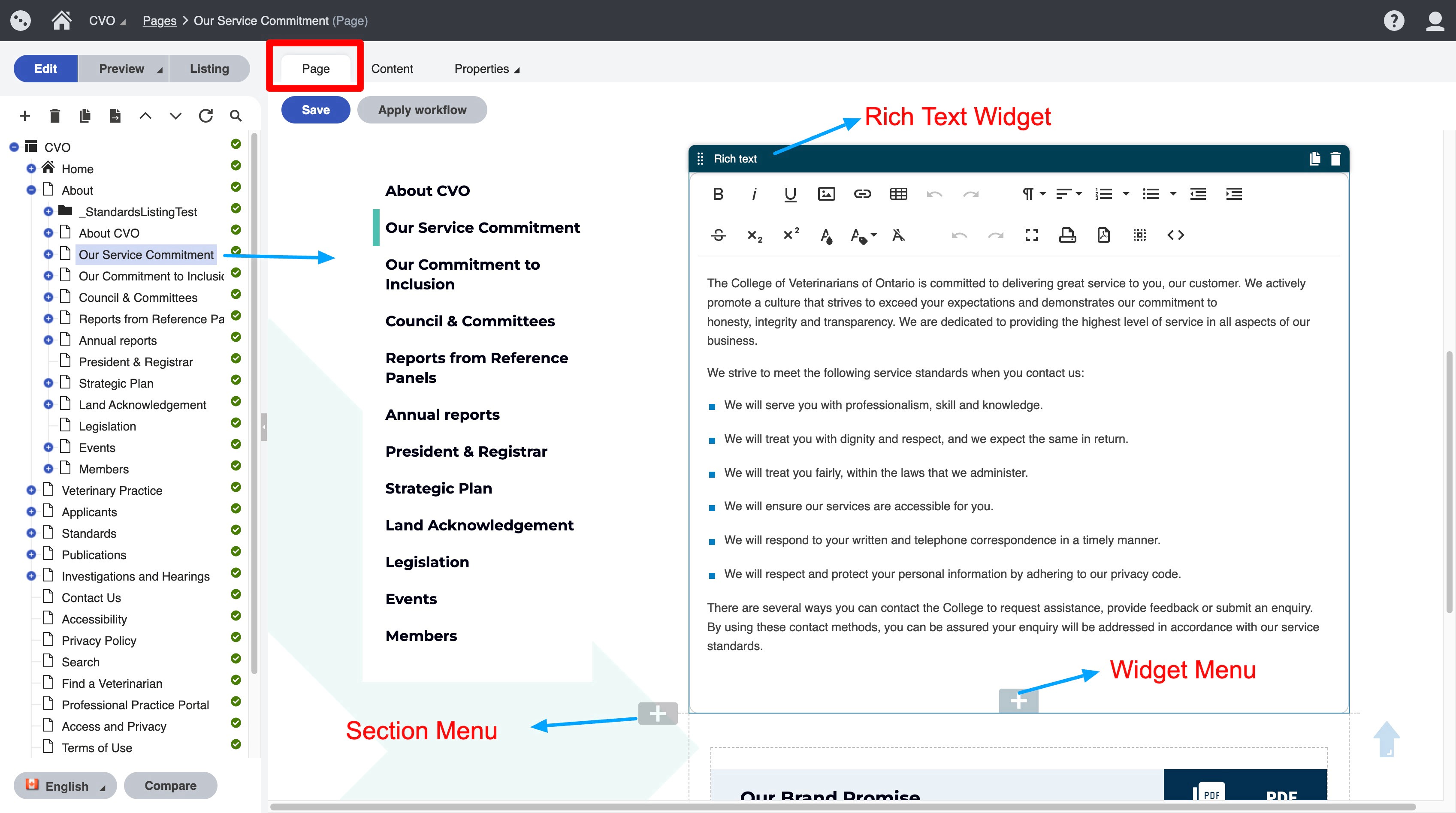
Please note: some pages may have content that is editable on all three tabs. An example of this is seen on traditional pages where the content edited on the “Page” tab, the title and template edited on the “Content” tab and the URL and meta-data is edited on the “Properties” tab
Page Tab
The "Page" tab is used for content editing within a page with the page builder. In the example below you can see the “Page” tab is selected, so you will see page content that is editable by clicking in the widgets on the page. We will go into details about the widgets here.
Content Tab
The "Content" tab is where consistent elements of a page and structured elements of a page are managed. The image below is an example of the same page edited on the “Content” tab.
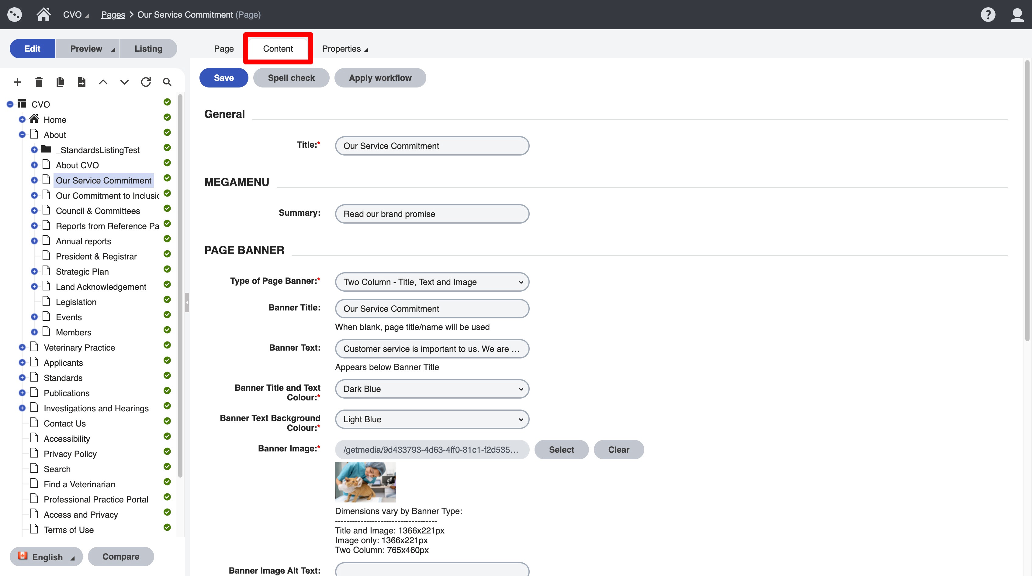
Options on the content tab vary by page type.
For the "Content Page" page type
- Title: name of page
- Page Banner: this will allow you to choose from the site banner options.
- No banner
- Title and Image: this will need a full width image and title over top
- Image only
- Two Column - Title, Text, Image. This is used throughout the site now. It also includes a button
- Title, Button - (In development) This will allow you to add a title and button as well as set a background colour
- Page Layout: this will change the layout of the page
- Single Column - used for full width pages where you want to use a lot of Image/Text CTA or widgets designed for full width (good for landing pages)
- Two Columns with Side Navigation - this is used throughout the content pages of the site
- Other options are specific to landing pages specified. You would not need to select these unless you wanted to create a new version of one of these pages
- Show Anchor Links Menu: this option when checked will allow you to add the anchor widget to the page in the "page" tab. This option will create the menu
- Hide this page from the side navigation: When checked, the side navigation will not display this page on any page that has the side navigation option enabled
- Publish from: allows you to set a publishing date
- Publish to: select "now" if you wish to unpublish page
Properties Tab
The properties tab includes some valuable information for content editing:
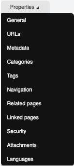
- General is used for general page information. Created date, page type are used most frequently
- URLs is used to add redirects for a page. If you have a URL that you are using for marketing you can add it as an "Alternative URL" and it will redirect, provided that the base url is the same as the website.
- Metadata is used to add title and descriptions to pages
- Navigation includes an option to show or hide a page from the menu. Make sure you uncheck this if you are creating a page you dont want added to the menu